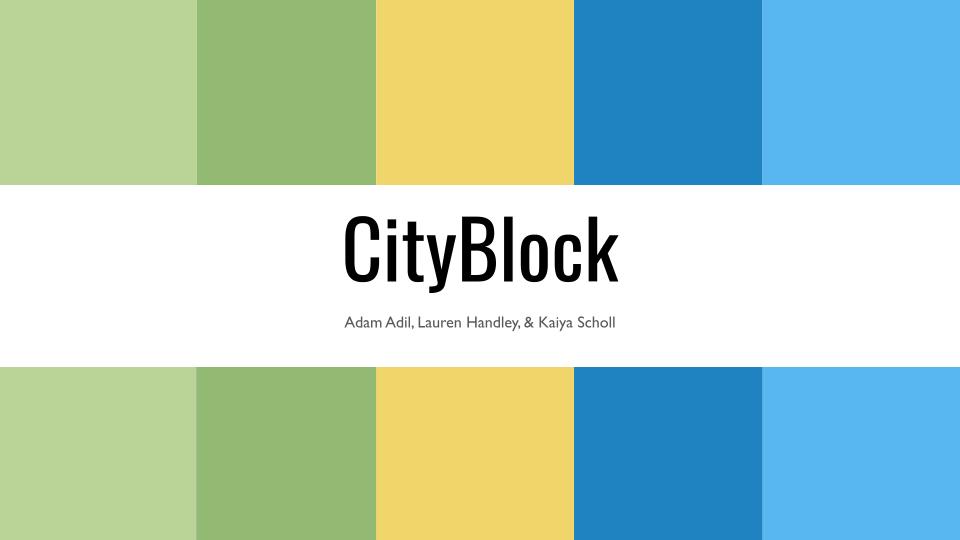
The Brief:
This was a group project where I worked with two of my classmates to create a branding for a health care brand that was assigned to us by our professor. Throughout the 8 weeks we talked to our professor and the teaching assistant as if they were the client that we were working for gathering any information we could to create an accurate brand for City Block.
Class:
Graphic Design Inquiry
Project Duration:
8 weeks
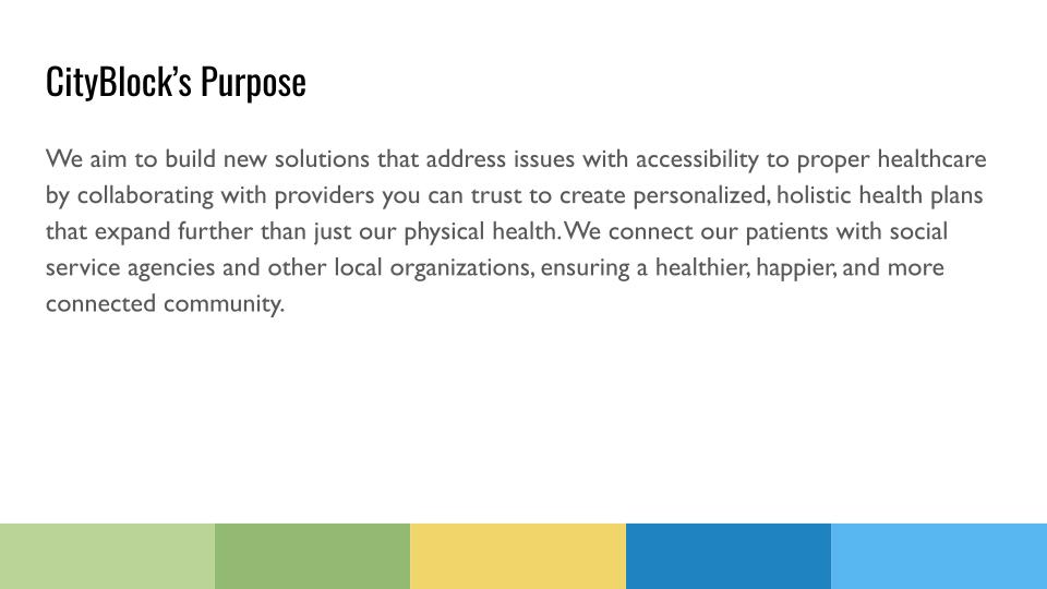
The Purpose
To start off we decided we needed to come up with a purpose statement. It was important to be able to describe the goals of this health care brand and show what it stands for. So as a team and after listening to our “clients” we got to work creating a health care brand that would fit with this purpose statement that was created.
The Strategy
Next up we designed a strategy that was going off our purpose statement. We wanted to be able to show what we planned to do with our brand and give people as much information as possible about our thought process with our branding.

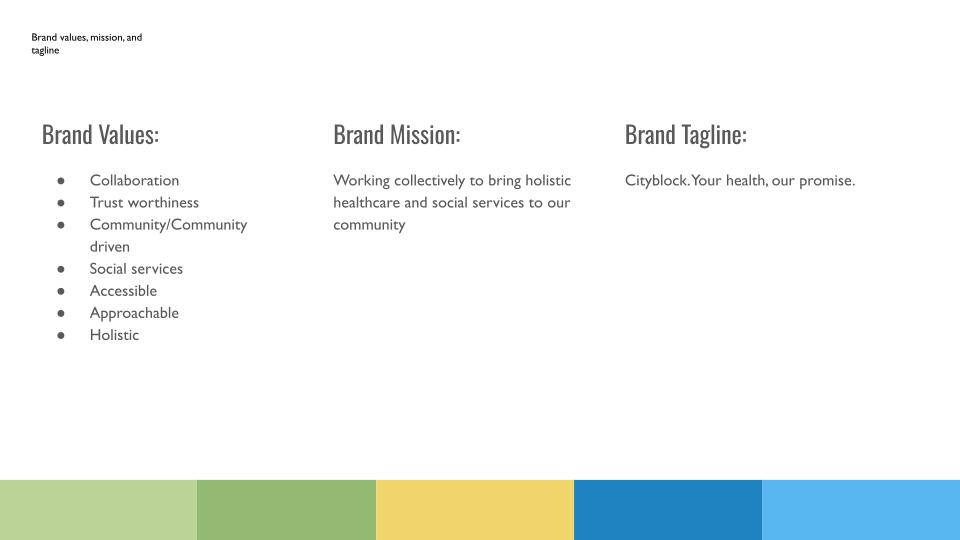
Brand Values, Brand Mission, and Brand Tagline
We felt it important to be able to share what our brand values were wanting to share what we pulled from when creating the branding and in hopes people would get what the branding was going for. These brand values also influences what the brand mission and brand tagline became.
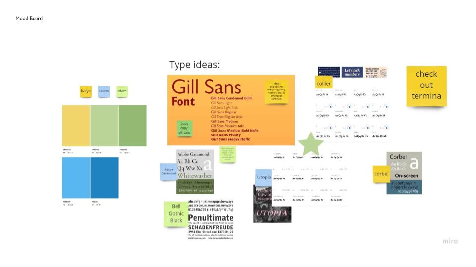
Part One of the Mood Board
Our first part of the mood board started off by sharing the type choices and the color palette that we had chosen from the very beginning.
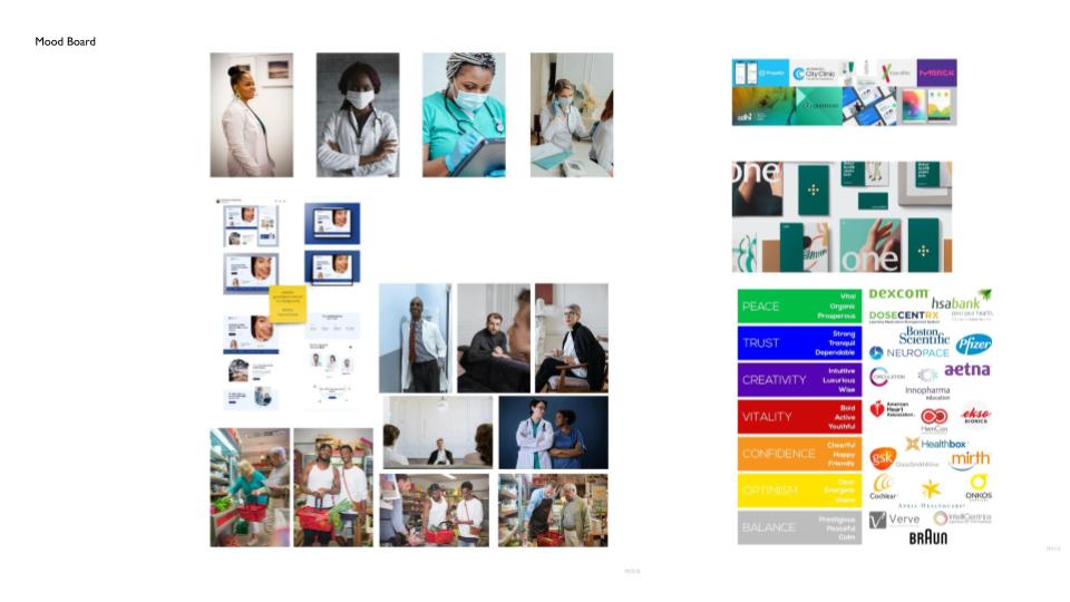
Part Two of the Mood Board
The second part of our mood board we started exploring imagery and other health care brands to figure out what type of direction we wanted to go with City Block. We were also trying to keep in mind those brand values while exploring and mood boarding things.
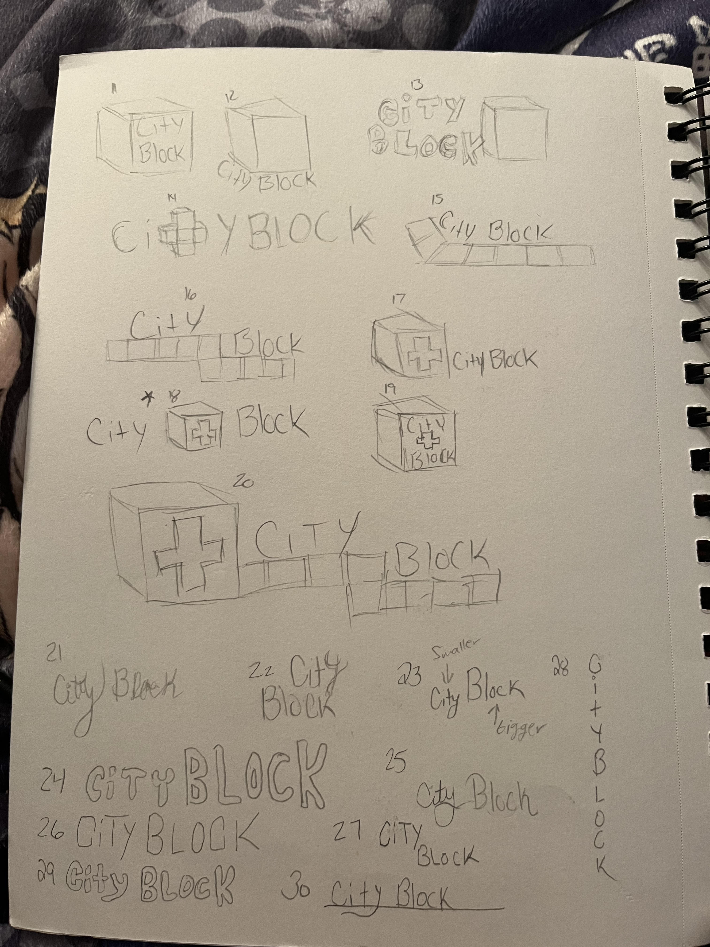
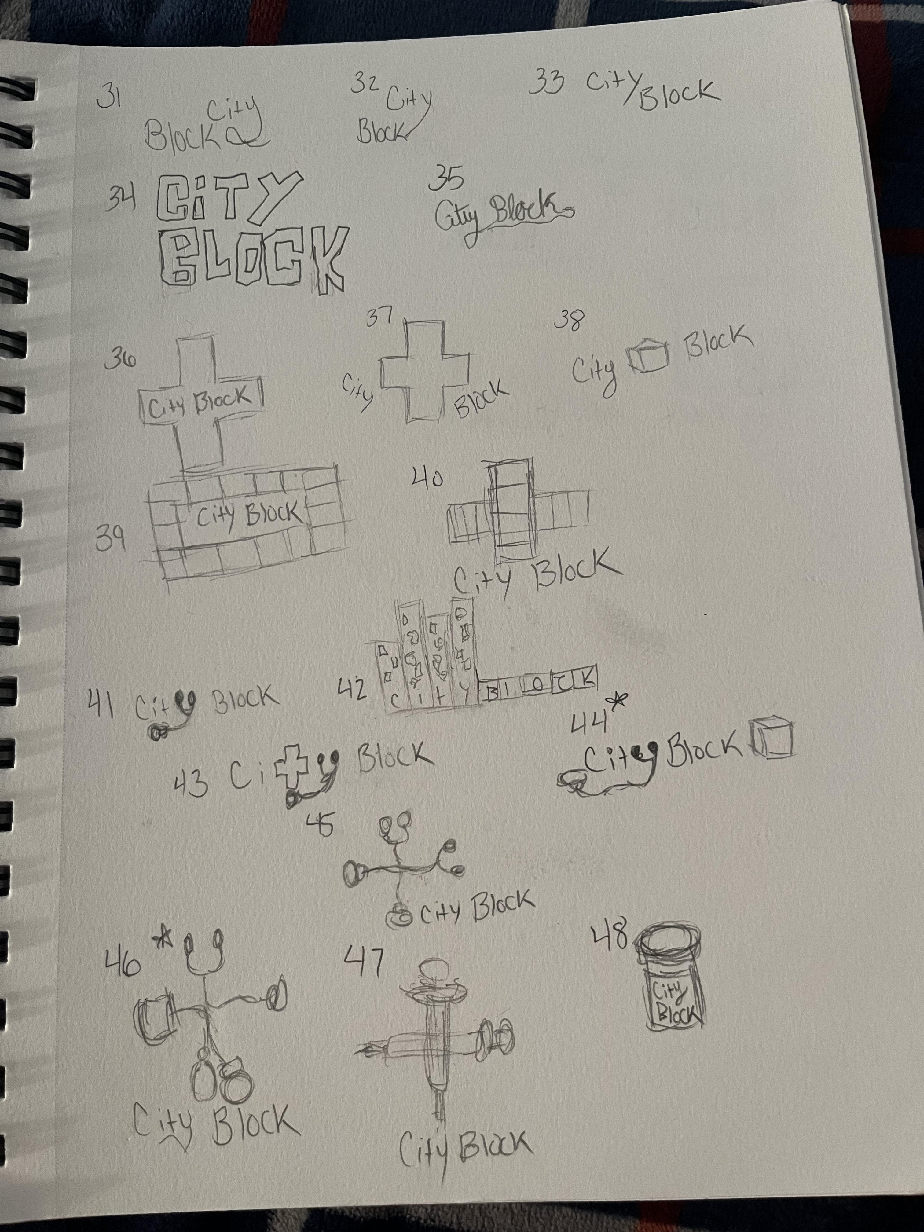
The Sketches
My sketches were three full pages of all sorts of possibilities. If felt important to explore any and all options and I had a lot of ideas that I was working through before choosing 3 to make vectors of and of course the final logo.
Page 1

Page 2
Page 3
My Logo Vectors
The One that Became the Logo
This logo became what will be the final logo but with a couple changes to the final. All it took was some adjustments for it to be the final.
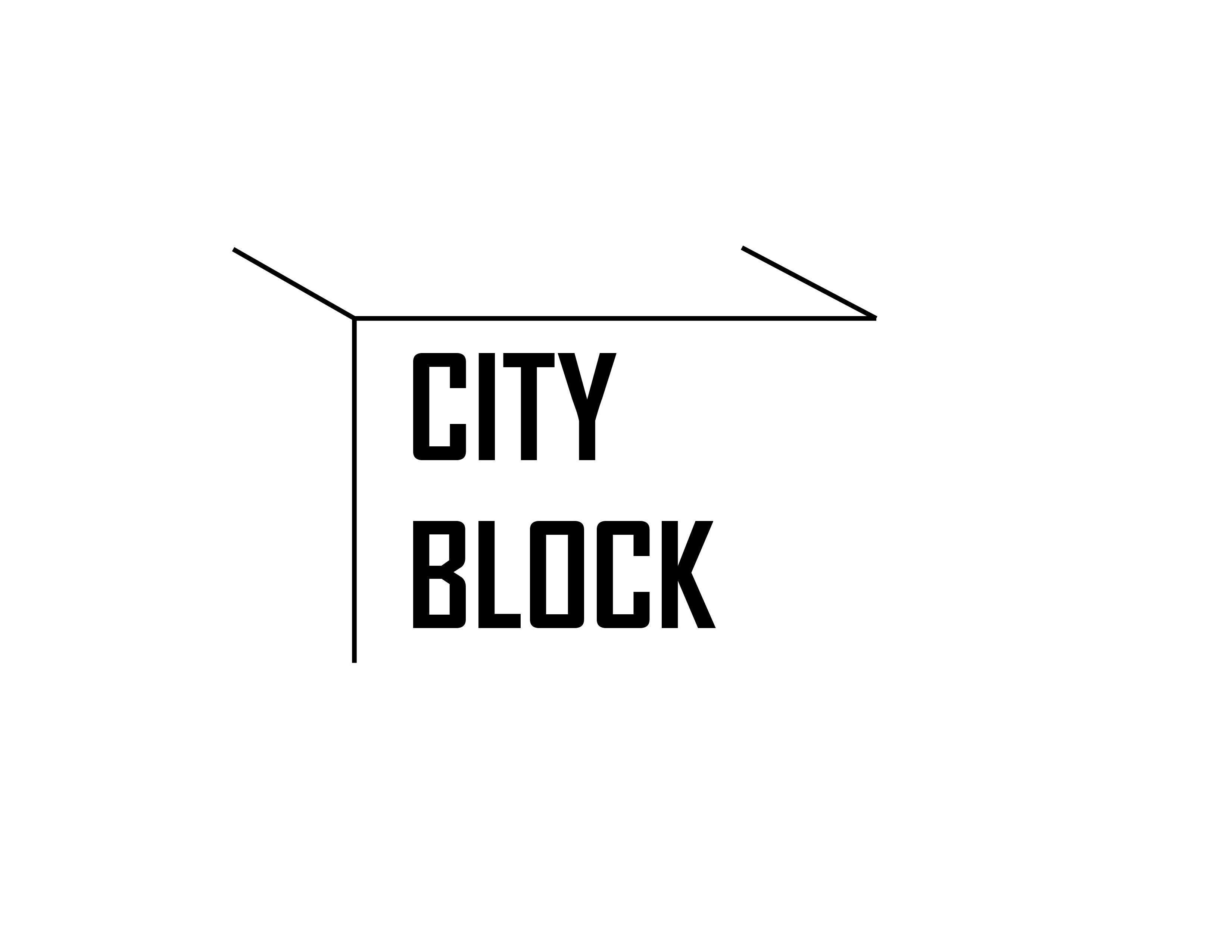
A Simple Block
This design which is still pretty similar to the last was one made for simplicity and I wanted to somehow keep the block shape.
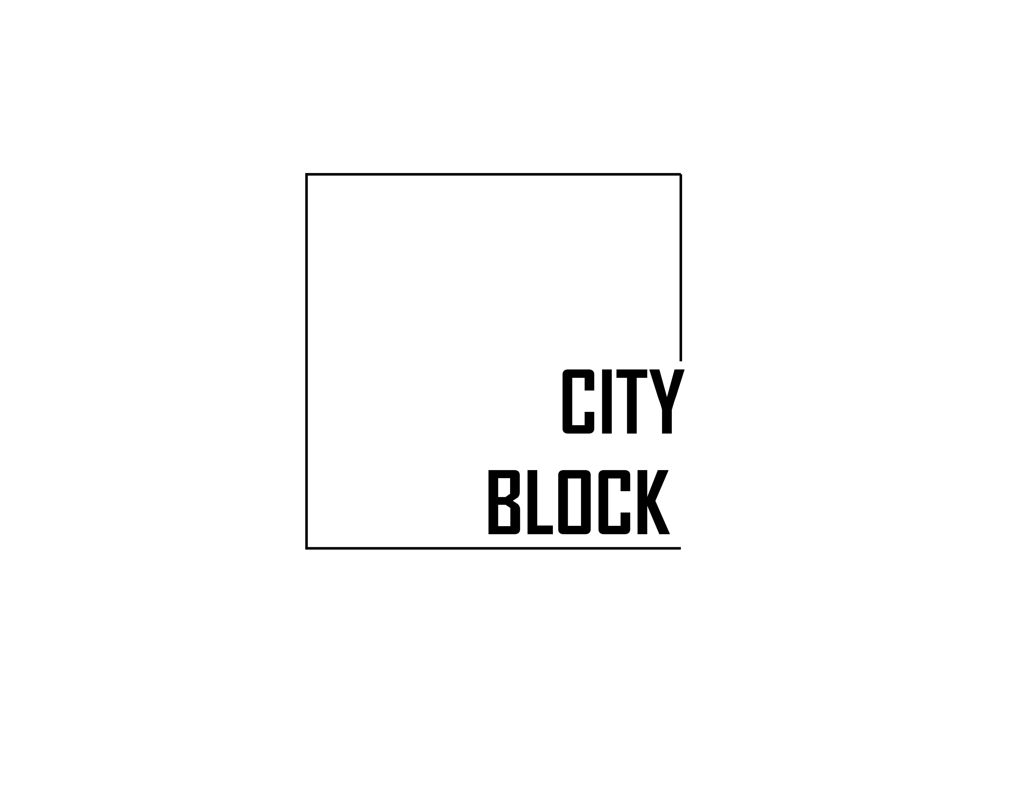
The Block with CB
The last vector of my possible logo was meant to keep a similar style to the second one but instead have the CB and the City Block.

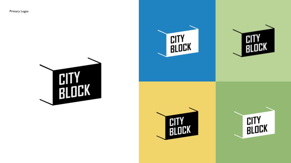
Our Final Logo
When it came to the logo we actually went with the one I created for us. We all contributed different logos, but as a whole we liked the simplicity and the fact that my design resembled a block being a play on its name. I remember when creating the logo I wanted something that could easily be scaled and used in all sorts of ways. It felt important that it could also work in different colors as well.
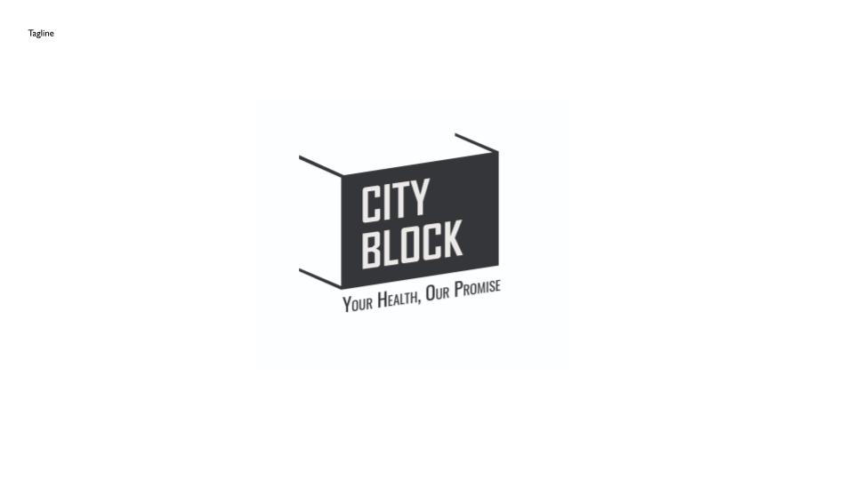
The Logo and Tagline
One of the big things that was liked about the logo was the fact it could work in multiple ways. One being that the tagline would work perfectly underneath the logo.
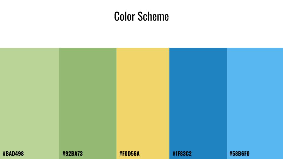
The Colors
From the beginning we actually had a color pallet chosen. My classmate Kaiya had used Adobe Color and we explored colors until we settled on this scheme. We felt that it was calming and not overwhelming and it felt with the brand we were creating.
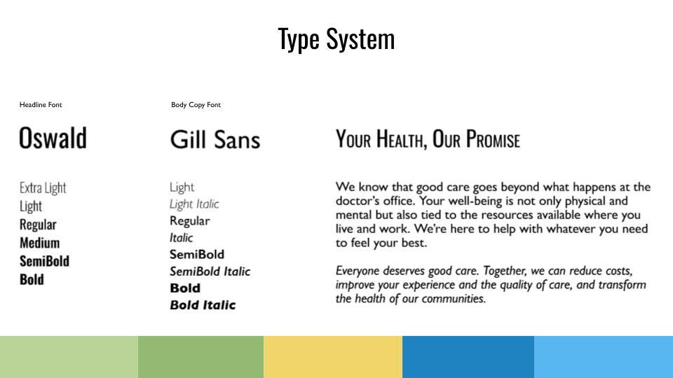
Type System
Our next step in our branding was our type system. We went with two san serif fonts as we found that they not only worked together but felt it worked really well with the brand we were working to create.
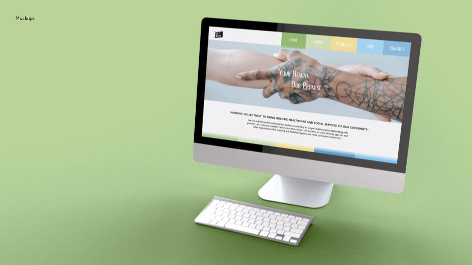
The Landing Page
This was created by my classmate Kaiya. She put in the time to create us a landing page for City Block using our colors and type and Imagery that worked with our brand.

The Business Card
Here we have the business card that I created. I wanted to show off how the logo is in fact scalable but also versatile because I took the type from the logo itself for the other side of the card. Showing how it can work also on its on and does not need the shape to be recognizable.
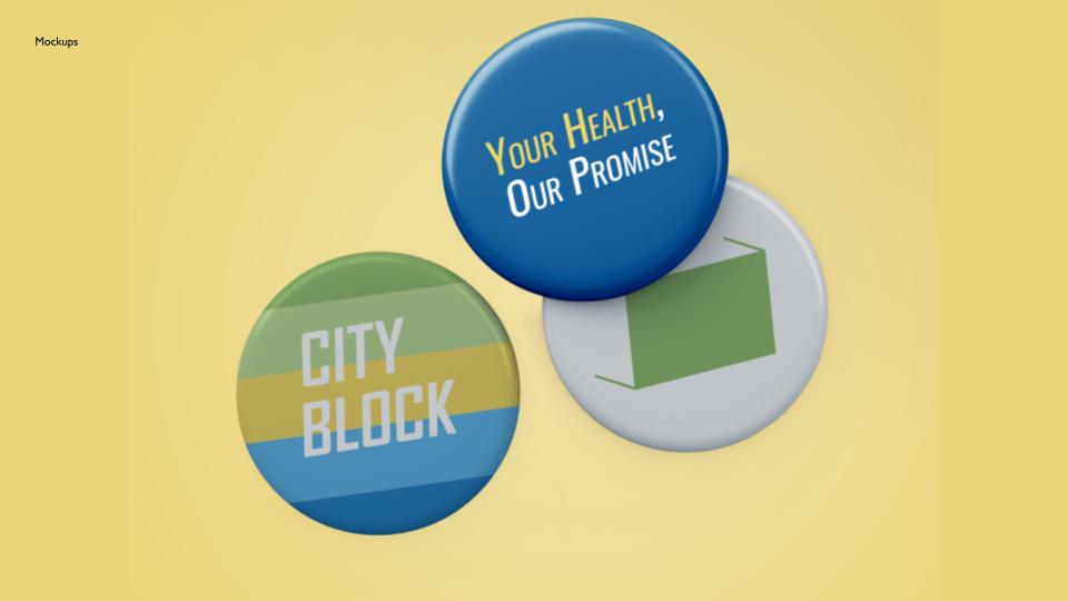
Pins
I also worked to create the City Block pins. I thought it was a fun way to advertise the health care as a whole. The pins work to show different aspects of the brand using the type and color choices that we used for the brand itself.
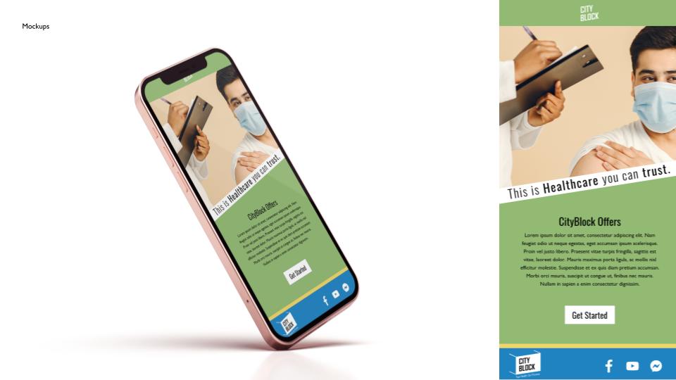
The Email
This final mockup and design was created by my classmate Adam. He worked with our branding elements to create an email that seemed friendly and not intimidating to anyone who would see the email about City Block.
