
The Brief:
For my type and design course at University of Illinois Urbana Champaign we were tasked with designing for future Olympic events. I was given the opportunity to build a brand for Brisbane 2032. Now, Brisbane has never hosted the Olympics so it was a fresh slate with only being able to look at how Sydney designed for their games. Throughout the process I kept in mind three words. Warm, Vibrant, and Thriving. With that I created my own branding for their summer games.
Class:
Type and Design
Project Duration:
16 weeks
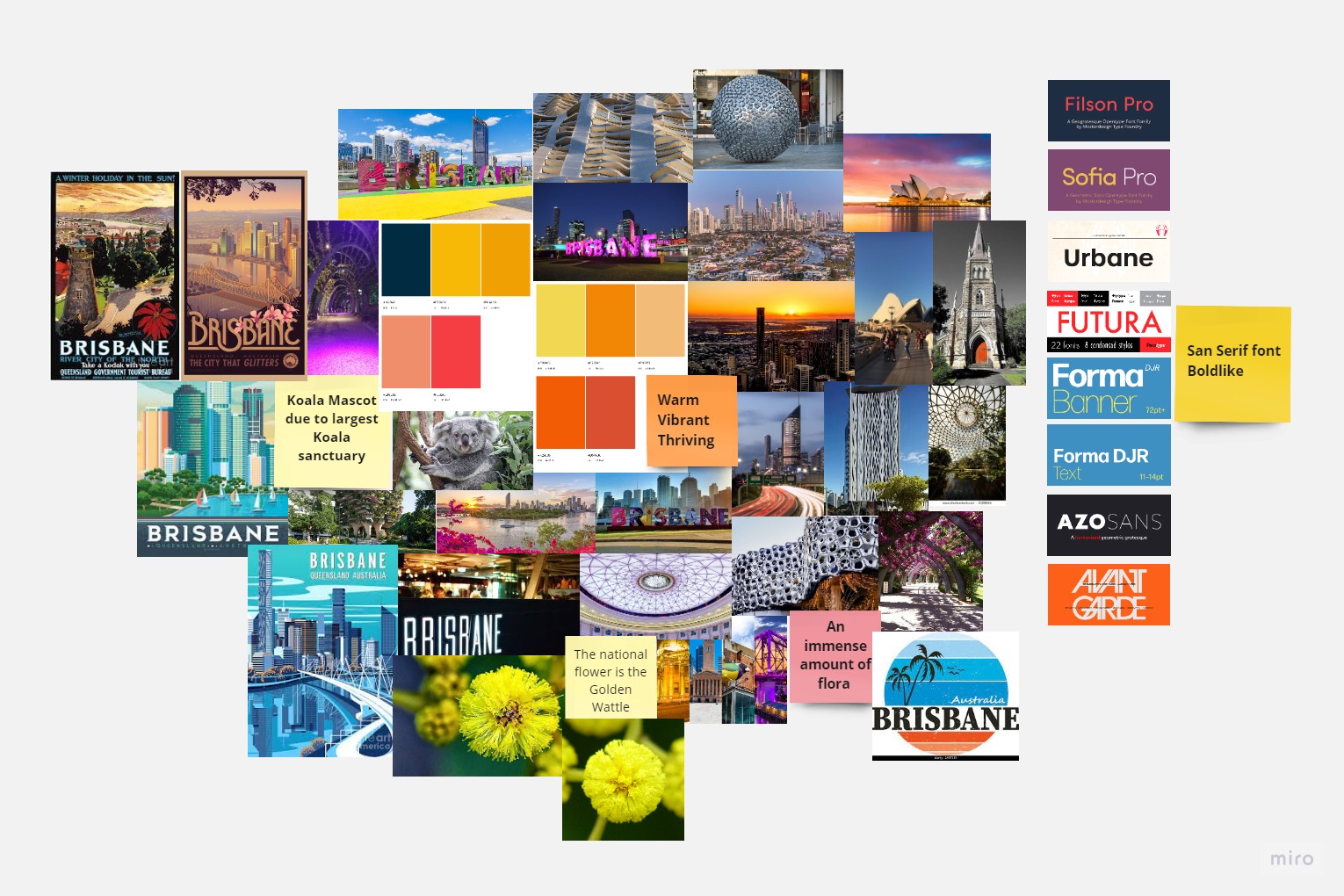
The Mood board
I started with researching about Brisbane Australia and thinking about how I wanted to represent Brisbane as a whole. Australia is a very warm place and it was important to me to be able to represent that thought. I worked through logo design, color choices, type, and imagery that was being used to showcase Brisbane online.
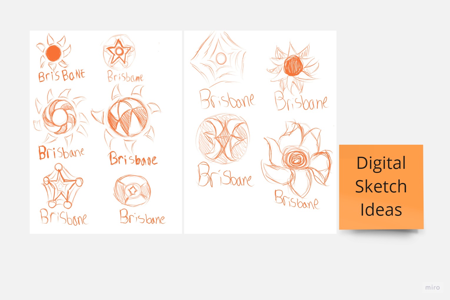
The Sketches
For my sketches I was envisioning something like a sun due to the sunny nature of Brisbane Australia. Brisbane is sunny at least 283 days of the year. I was also thinking a little bit about its national flower, but the sun was my choice in the end.
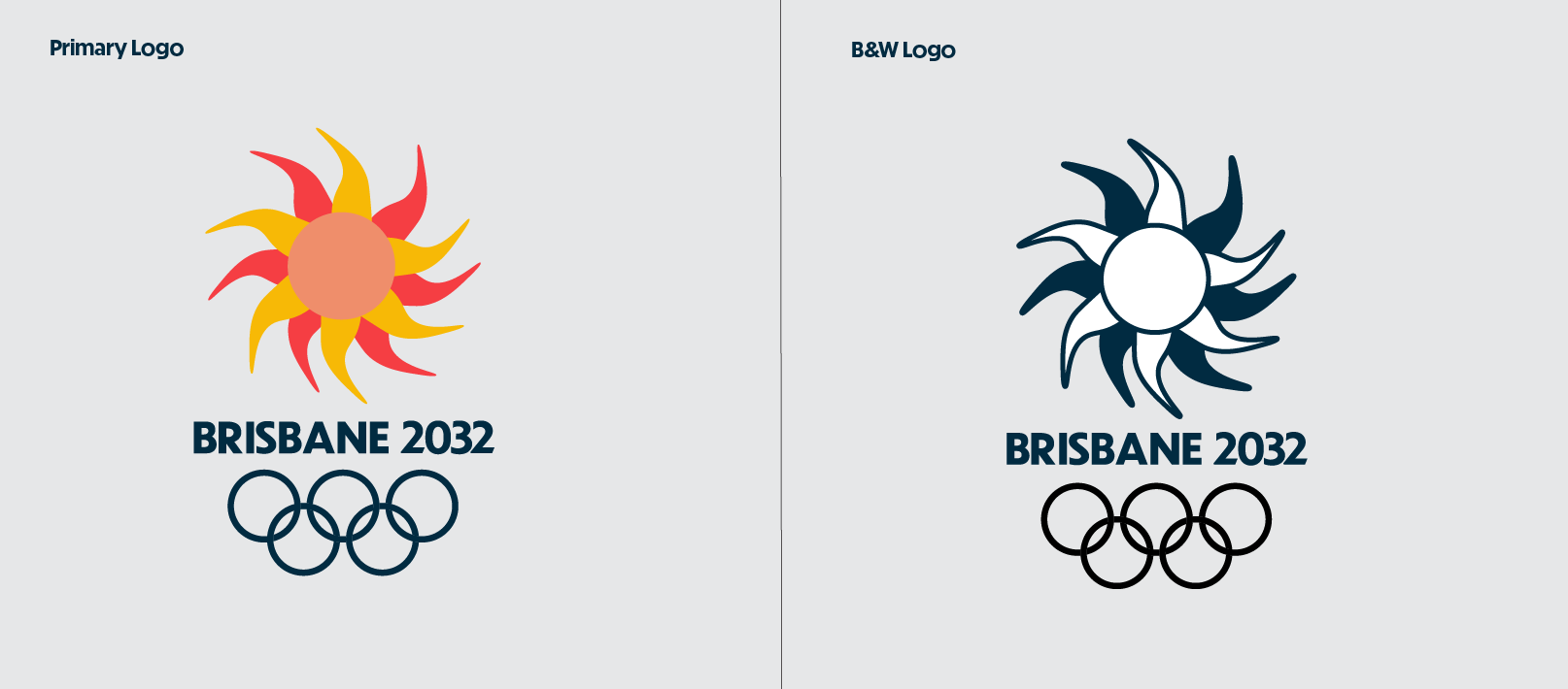
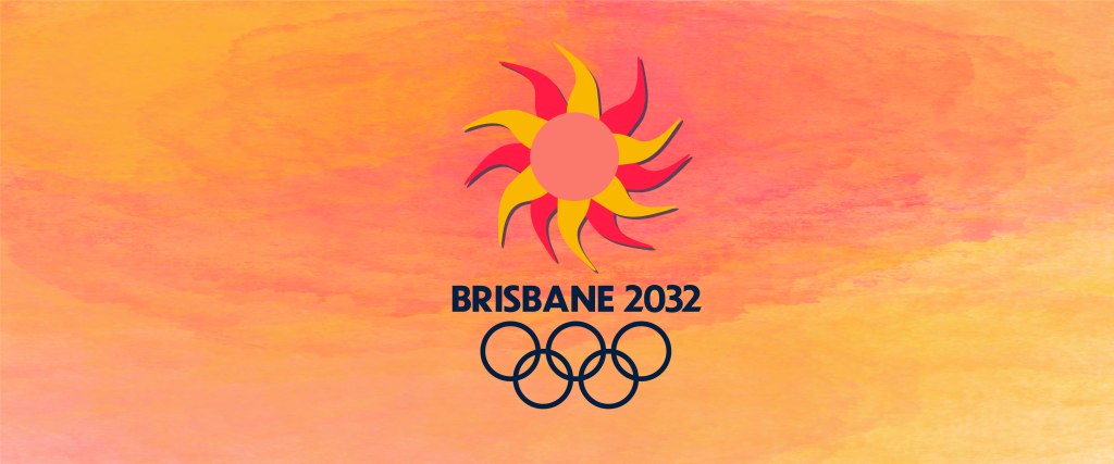
The Logo
In the end, I captured the aspect of the sun and how it is always shining in Australia. It also worked really well with the three words that I kept in mind as I was designing.
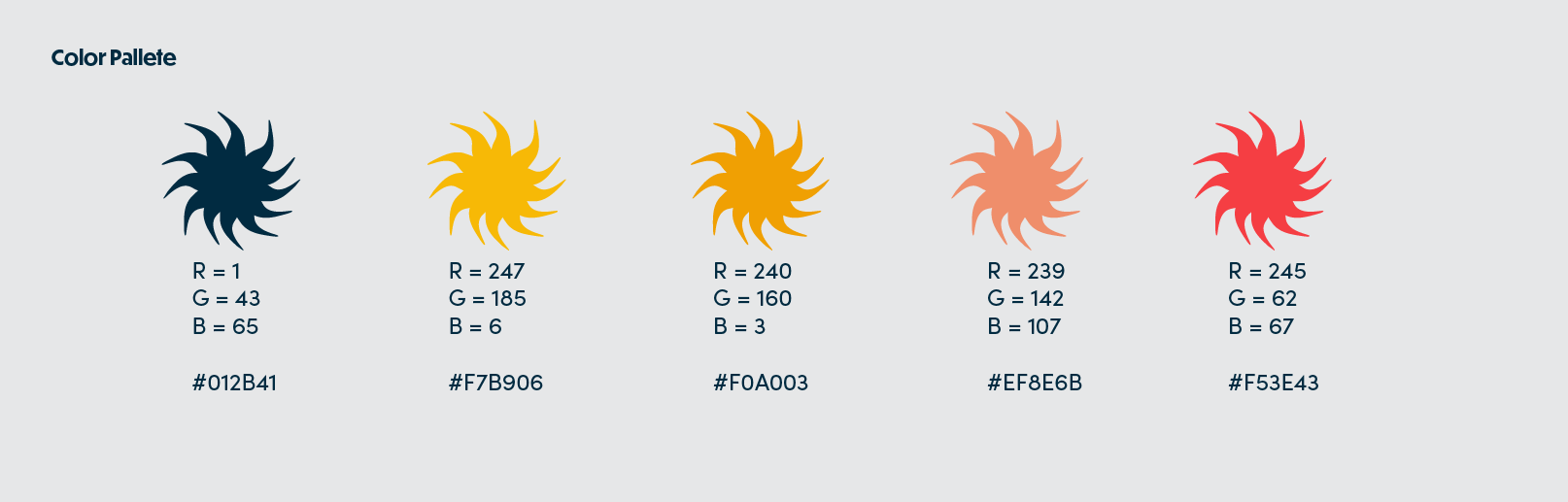
Color
The colors I had chose are supposed to represent a warm summery environment specifically because the games happening in Brisbane are during the summer time.
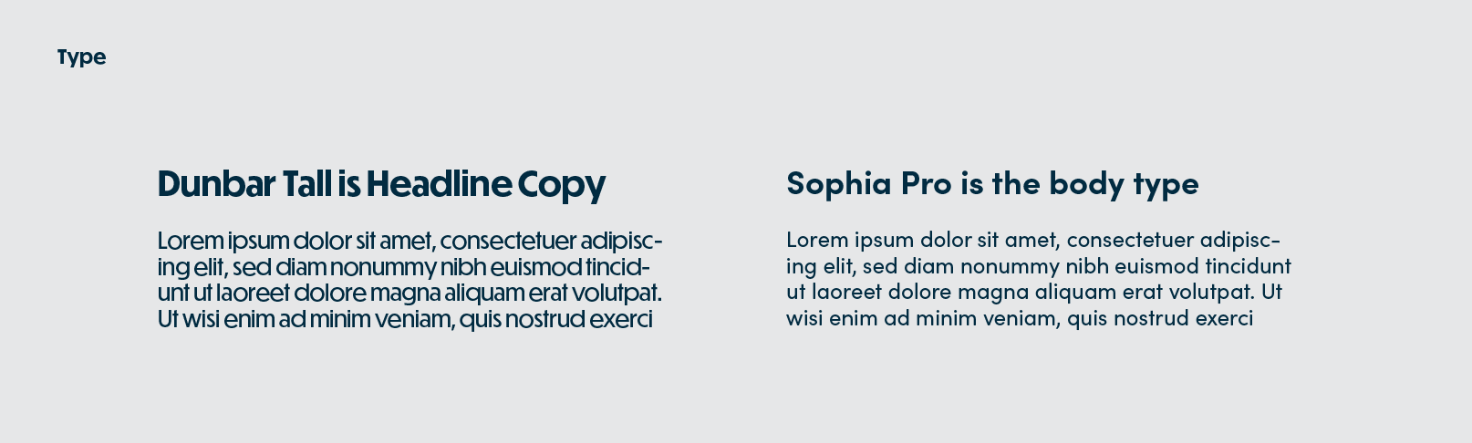
Type
The type was chosen to be two San Serifs, I paired them because they seemed to fit well together amongst my designs.
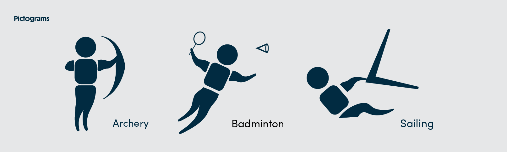
Pictograms
For the branding one of the most important things to have is pictograms. You see them with every game. I wanted to use the suns rays from my logo when creating the pictograms.
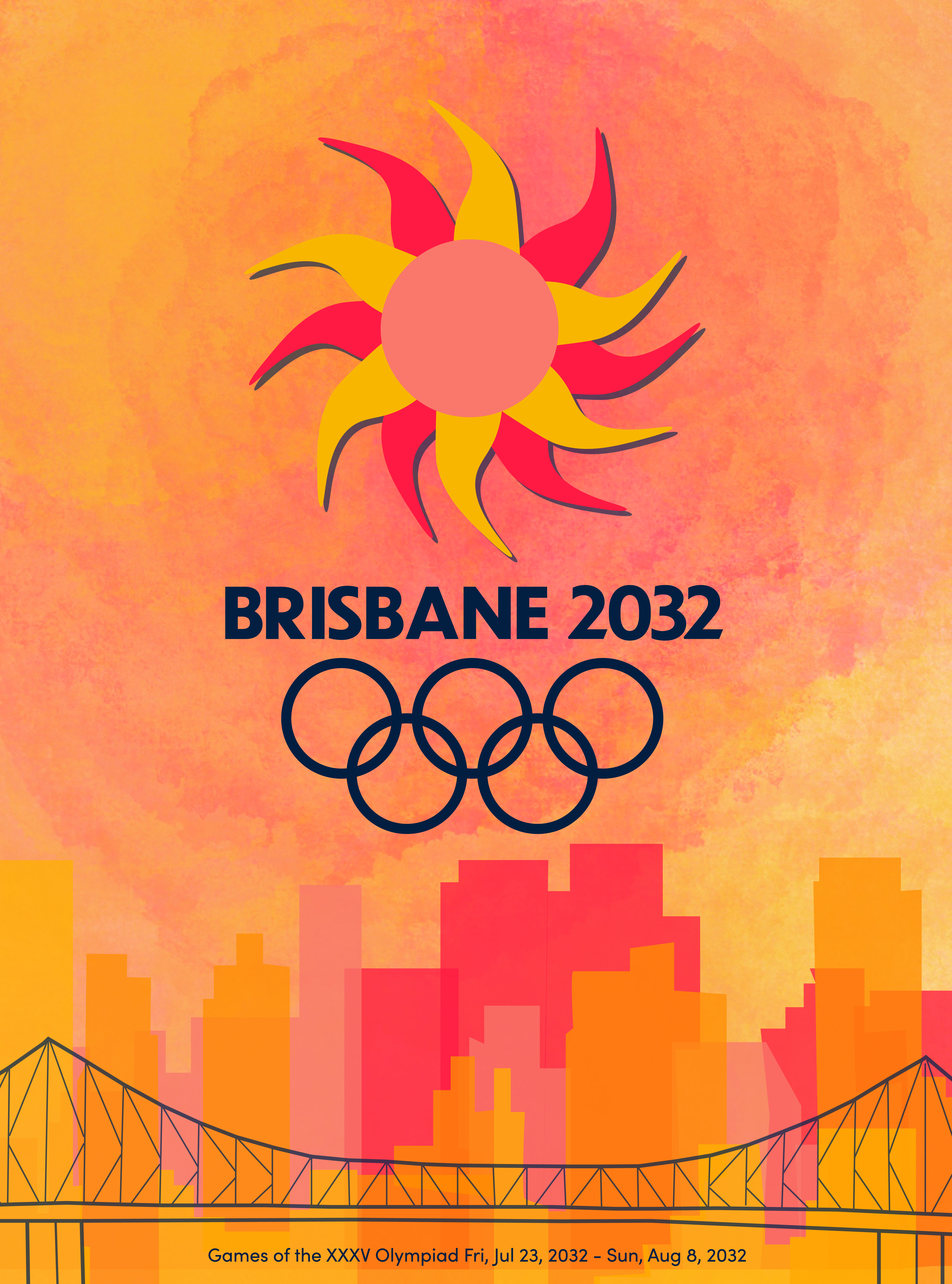
The Poster
The poster draws inspiration about the city itself and the architecture for example the bridge is one that I created from a photo of a bridge in Brisbane and of course we have my color palette and aspects that are shared above.
The Mockup
The thought process was that there would be posters up around Brisbane kind of like how this is displayed.

Merch
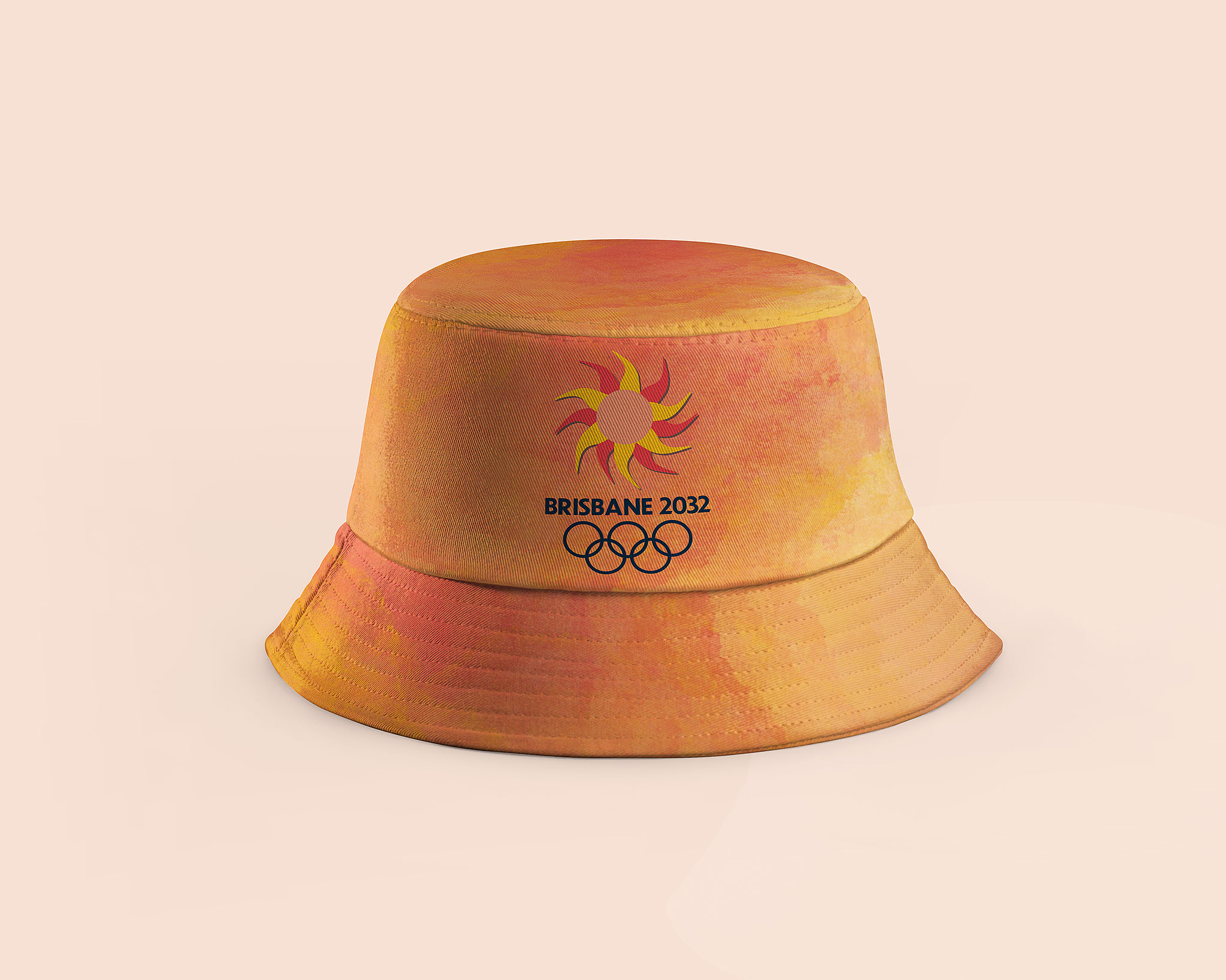
The Bucket Hat
The Bucket hat brings back previous pattern along with the logo for the Brisbane Olympic games. It will also be helpful with how sunny Brisbane is.
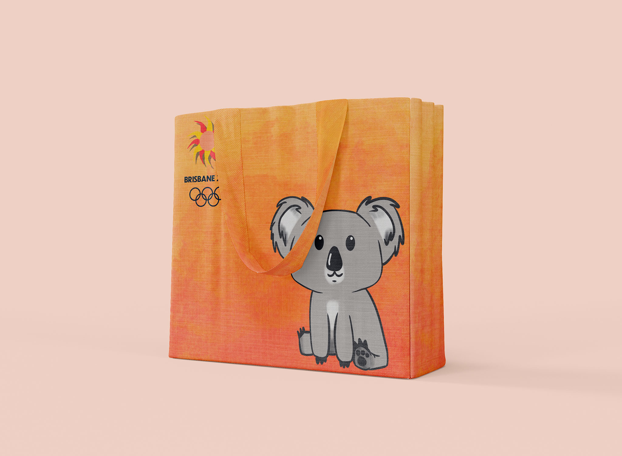
The Tote Bag
This tote bag features Brizzie the Koala the mascot I created for the games. I chose a koala due to being a popular species there.
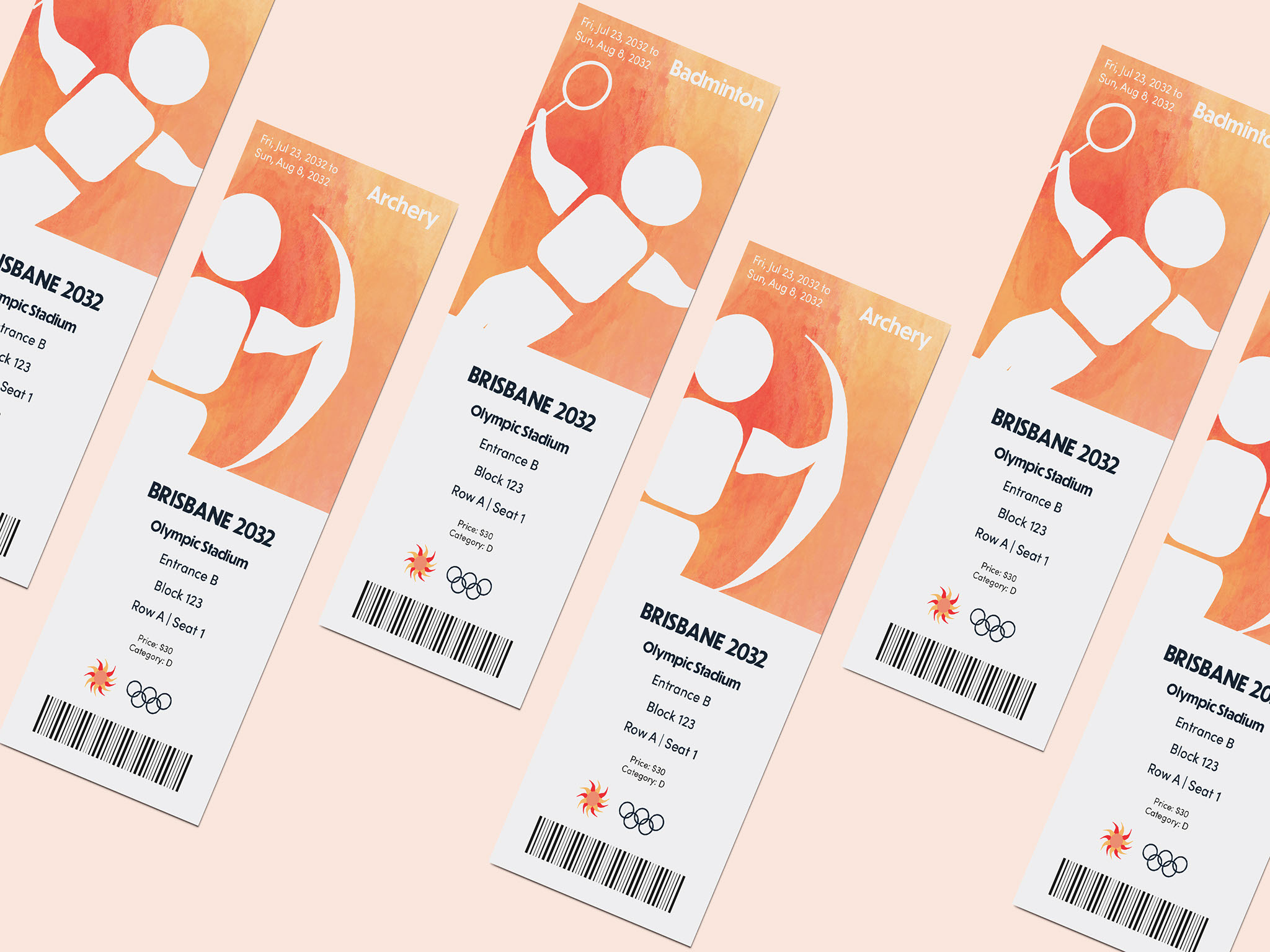
The Tickets
Here we have the tickets which bring back the pictograms that were created for the games along with that colorful and warm pattern.
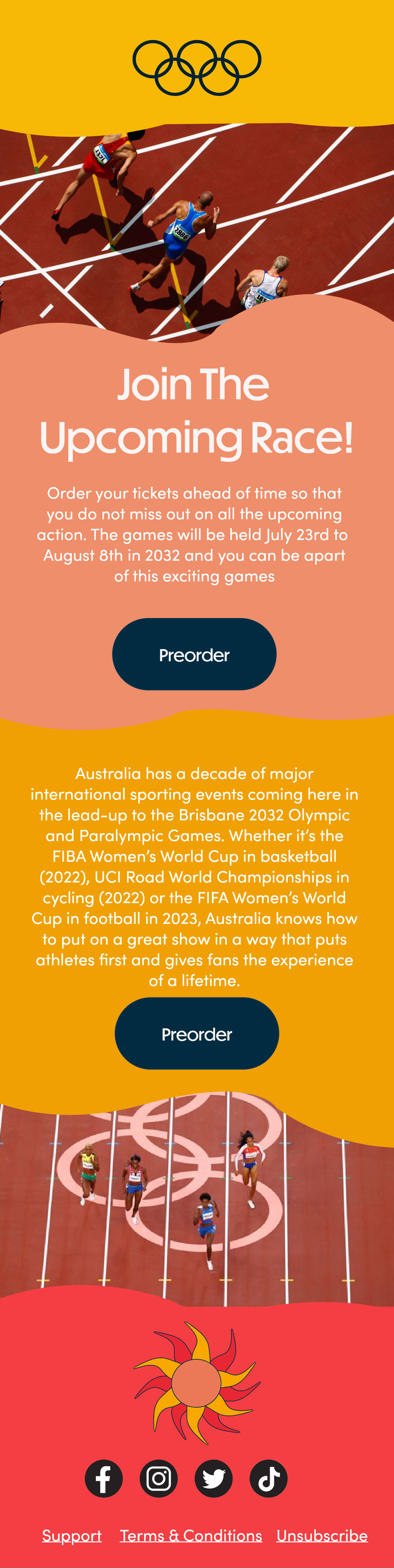
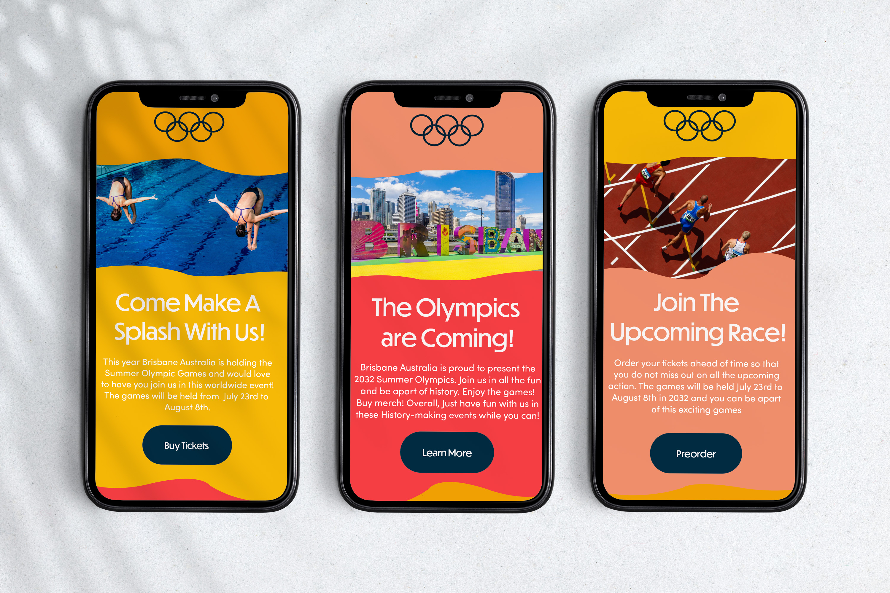
The Emails
Preorder Tickets
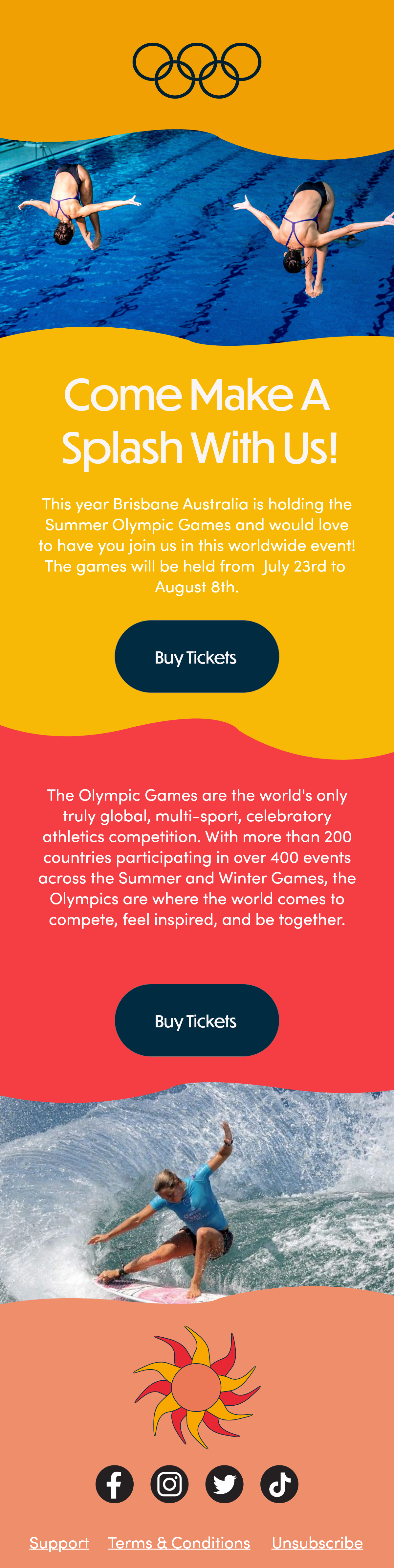
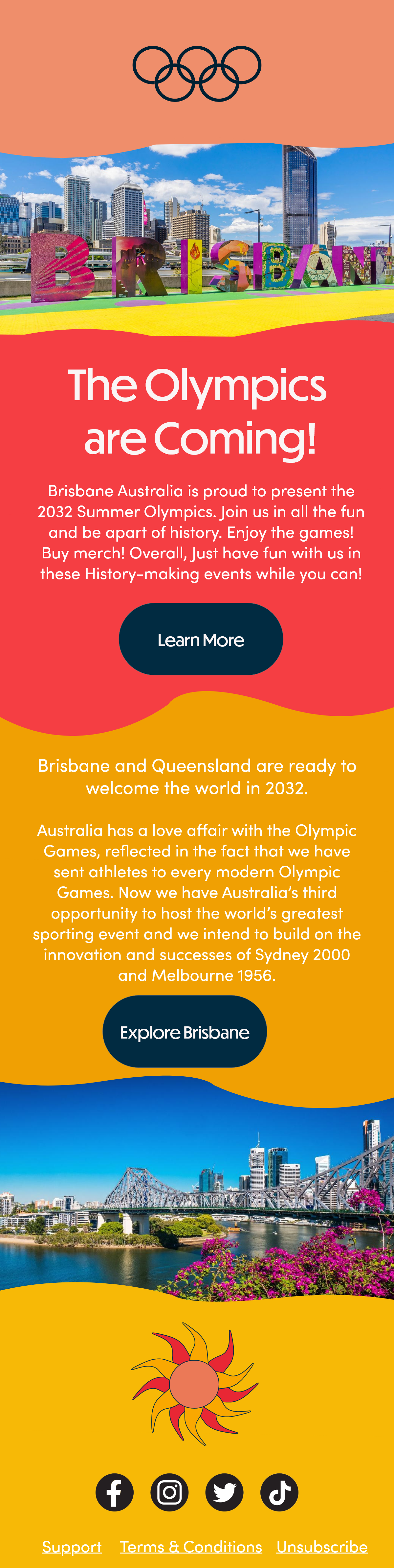
This email is designed to give people a chance to preorder their Olympic tickets. I also kept a similar wavy pattern in all of the emails and using alternating colors.
Buy Tickets
This email is designed to come out when tickets are no longer on preorder so people have a chance to still buy them. Much like the others it keeps a similar pattern.
Learn About Brisbane
This final email would be there to teach people about where the games are being held and giving them other information that may be needed. It is definitely important to learn where you are going.
The Mockups
Here we have what I would imagine the emails looking like if they were being viewed on someone’s phone.
A Video Mockup
Here I created a video mockup of what the email would look like if someone was scrolling through on one’s computer.
